

The Confidence number
The result summary at the top of the Overview tab shows one Confidence number for your primary metric.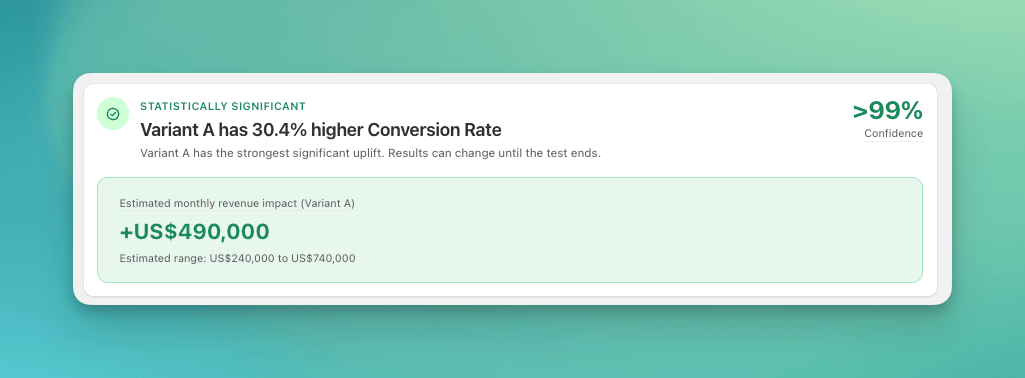
The result summary for a statistically significant test
Confidence tells you a gap this large would be unlikely if the test groups were really the same. It is not the probability that the test group is better. For that estimate, check Prob. Beat Control in the Statistical Significance table, and read the caveat below.
The Statistical Significance table
The Statistical Significance table, in the Performance section under the Overall tab, shows the full statistics for the selected metric, one row per test group.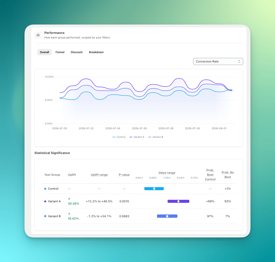
The Statistical Significance table under the metric chart
How to read the p-value
How to read the uplift range
The uplift range shows where the true uplift most likely falls. A narrow range means a stable estimate. A wide range means more uncertainty. For example, an uplift of +30.4% with a range of +12.2% to +48.5% is a strong result: even the low end of the range is a meaningful gain. An uplift of +16.4% with a range of -1.2% to +34.1% is not a clear result yet, because the range still includes zero. The same result can show a Prob. Beat Control near 97%, which looks convincing, but Confidence is still the number that decides.Prob. Beat Control and Prob. Be Best
These two columns come from the same data as Confidence, so they do not add new evidence. They only show it on a higher scale: a Prob. Beat Control of 97% is the same result as a Confidence of about 94%, which is not significant. The 95% rule applies to Confidence, not to these columns. Use them to see which test group looks better so far. They can change as more data arrives. The result summary does not use them. Significance is decided by the p-value alone, so treat these columns as supporting context, not as the deciding number.How to go from statistics to a decision
Make the decision at your planned end date. Check Confidence first, then treat the low end of the uplift range as a realistic worst case, then judge whether the gain is worth the rollout. How to interpret Analytics results walks through the full decision.What to do when results are inconclusive
Sometimes the result is still unclear after several days. That is normal. If the statistics stay mixed:- Keep the current version, usually Control, while you collect more data.
- Use the Breakdown table to check segments such as country, device type, or visitor type for hidden differences.
- If signals stay flat, treat it as “no meaningful difference” and test a bigger idea next.
Common mistakes
- Reading significance off the chart or the value bars. Two lines that look far apart on the trend chart, or two value bars that overlap in the table, are not the verdict. The comparison is a test on the difference, not on how the visuals look. Read Uplift range and P-value.
- Treating a wide significant range as a forecast. An uplift range like
+0.4% to +38%clears the gate and still tells you almost nothing about what a rollout will earn. A range that wide means too little data, not a big win. As a rough floor, give each test group at least 100 Orders before you plan against the number, and several hundred if the change you are testing is smaller than about 20%.