

Accessing your analytics
To view analytics for a test, go to the test table on your ABConvert homepage and open the Analytics dashboard for that test.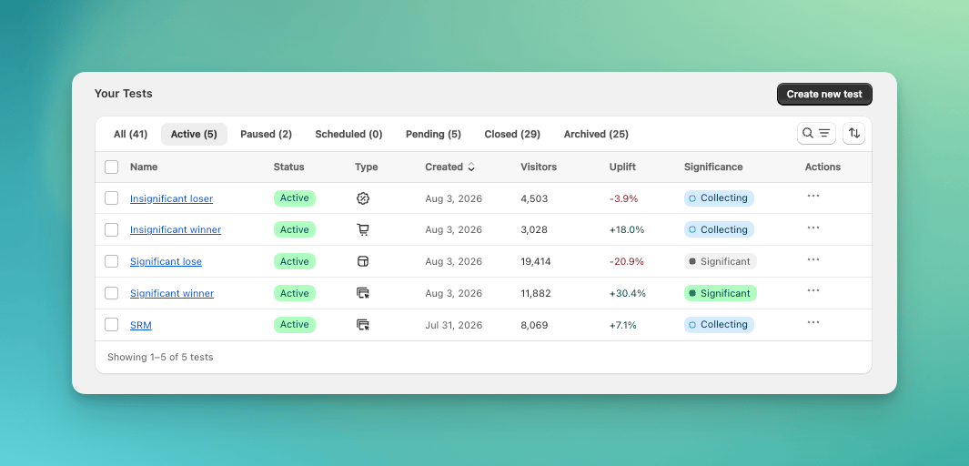
Open analytics from the test table
How the page is organized
- Test info: when the test started, how long it has run, and how traffic is split.
- Toolbar: filter the data, check its health, and export orders.
- Result summary: whether one test group is better, and how strong the evidence is.
- Metric cards: the four key metrics, compared across test groups.
- Performance: the detailed numbers behind the summary.
- Engagement: how visitors interact with your pages.
- Custom Events: how often visitors trigger the merchant-defined actions selected for this test.
The result summary
The summary shows whether one test group is better on your primary metric, for example “Variant A has 30.4% higher Conversion Rate”. Early in a test, it says Collecting data and shows progress toward first results.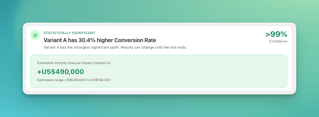
The result summary
- The Confidence number shows how strong the evidence is. At 95% or higher, the result is statistically significant. See Statistical significance.
- Estimated monthly revenue impact estimates what the best test group would add to your monthly revenue if all traffic saw it. The estimated range applies the 95% confidence interval of the measured difference, so it shows how much that estimate could vary.
Metric cards
Four cards compare the metrics that matter most for a revenue decision: Revenue per Visitor, Conversion Rate, Average Order Value, and Profit per Visitor.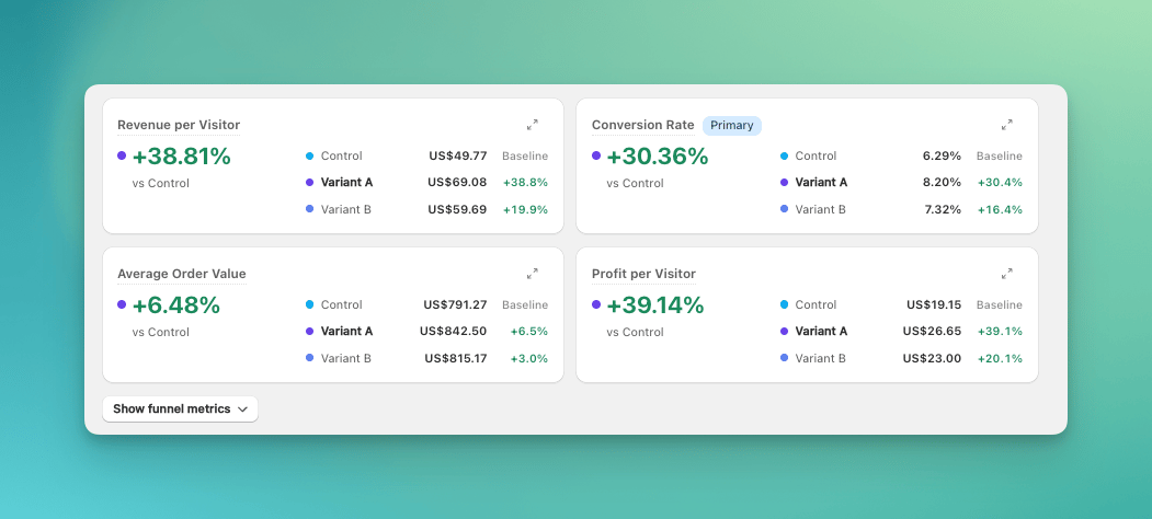
The four metric cards
- The Primary badge marks your primary metric.
- Each card compares every test group against Control.
- Click Show funnel metrics to add funnel rates such as Add-to-cart Rate and Reached Checkout Rate.
- Click the expand icon on any card to open a detailed view of that metric, including the uplift range, p-value, and sample size per test group.
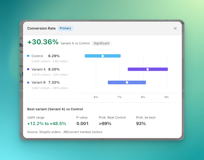
Expand a metric card for the full statistics
Performance
Overall
A chart of any metric over time, with the Statistical Significance table below it. See Statistical significance for how to read each column.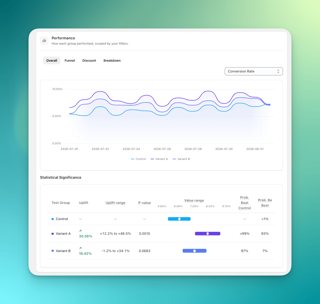
The Overall tab: metric chart and Statistical Significance table
Funnel
The conversion funnel shows where visitors drop off, per test group. It counts sessions at each stage, not visitors, so Sessions is the 100% baseline and a visitor who returns and drops off again counts twice.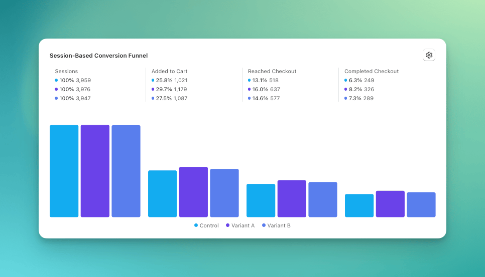
The conversion funnel per test group
Sessions
Added to Cart
Reached Checkout
Completed Checkout
Custom funnel steps
You can customize the funnel to track more detailed steps like Shipping Information Submitted or Payment Submitted. This lets you see exactly where visitors drop off in your checkout flow.- Open the Funnel tab in the Performance section.
- Click the gear icon in the top right of the funnel.
- Select and reorder up to 5 steps. Sessions stays fixed as the baseline.
- Click Apply.
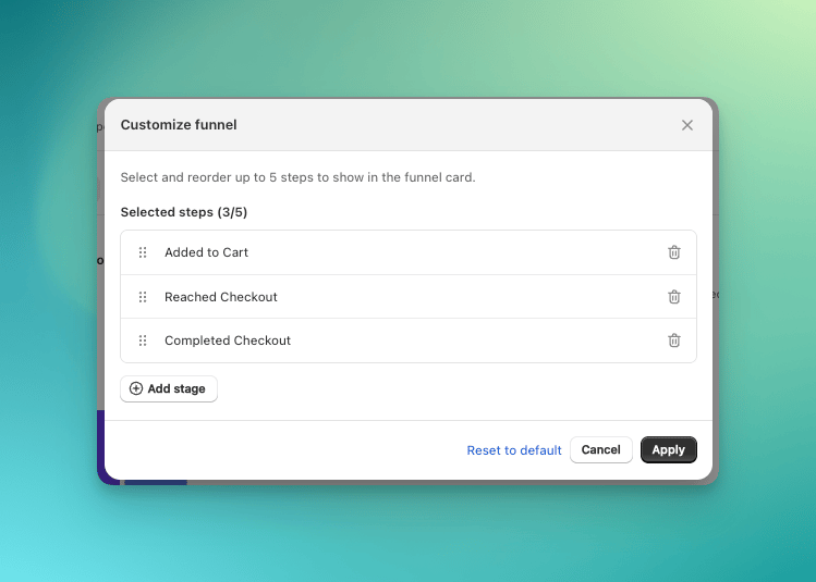
Customize the funnel steps
Discount
Discount metrics show how much discount cost contributes to each test group’s result: how many orders used a discount, and how much revenue and profit the discounts cost. See Discount metrics.Breakdown
The Breakdown table lets you compare the metrics you care about across test groups and audience segments. A segment dimension, such as country or device type, splits the results into one row per value.- Use Metrics to choose which columns to compare, such as visitors, orders, conversion rate, or average order value.
- Select Product, Country, Device Type, Visitor type, or Traffic Source to group results by one preset dimension. See Product breakdown for how the Product tab works.
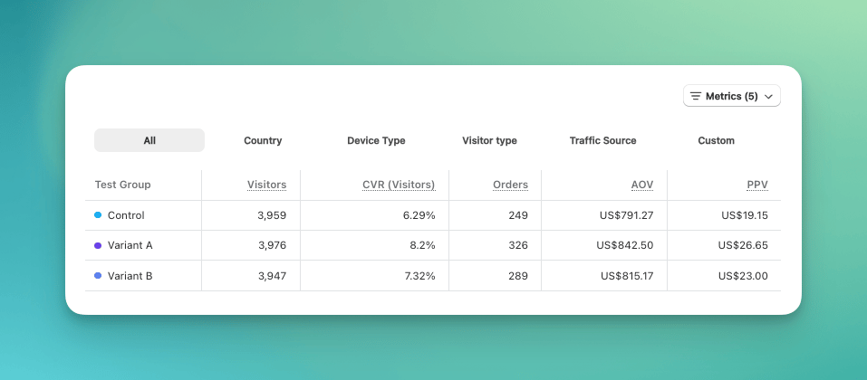
Preset dimensions in the Breakdown table
Open the custom breakdown
Choose the primary dimension
Choose the secondary dimension (optional)
Apply your dimensions
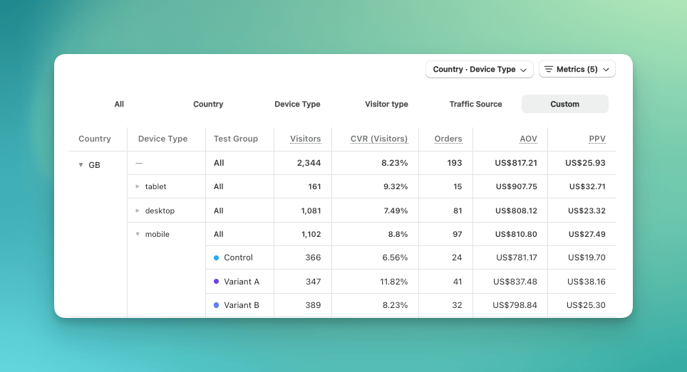
A custom breakdown with two dimensions
Product breakdown
The Product tab shows how each product and product variant performed in each test group. It covers every product observed in the test, so you don’t need a product group to use it. Apply a product group only when you want to narrow the table to that group’s products. Product variant rows show Added to Cart, Reached Checkout, Completed Checkout, Orders, Revenue, Profit, Units sold, and Margin. Visitors, sessions, and rates show--- for product variants, because a product view records only the product variant selected when the page loads, and shoppers often switch product variants after that.
Products are ranked by revenue. The table shows the first 25; click More products to show 25 more. Each product shows its top product variants by orders; click Show more product variants to see more.
When the table can’t list every product or product variant, a warning appears above it:
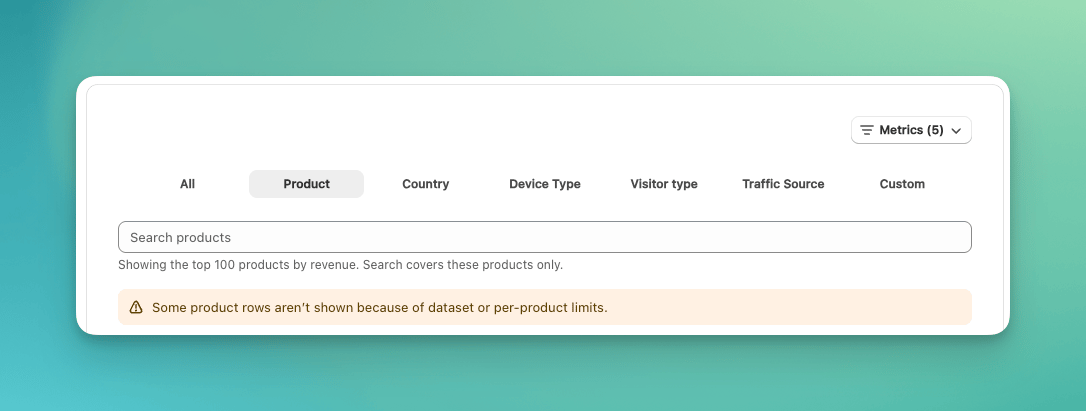
The warning shown when some product rows are left out
Engagement
The Engagement section shows whether a test group keeps visitors interested: how often they click through, how often they bounce, and how long they stay. Click Show engagement to open it.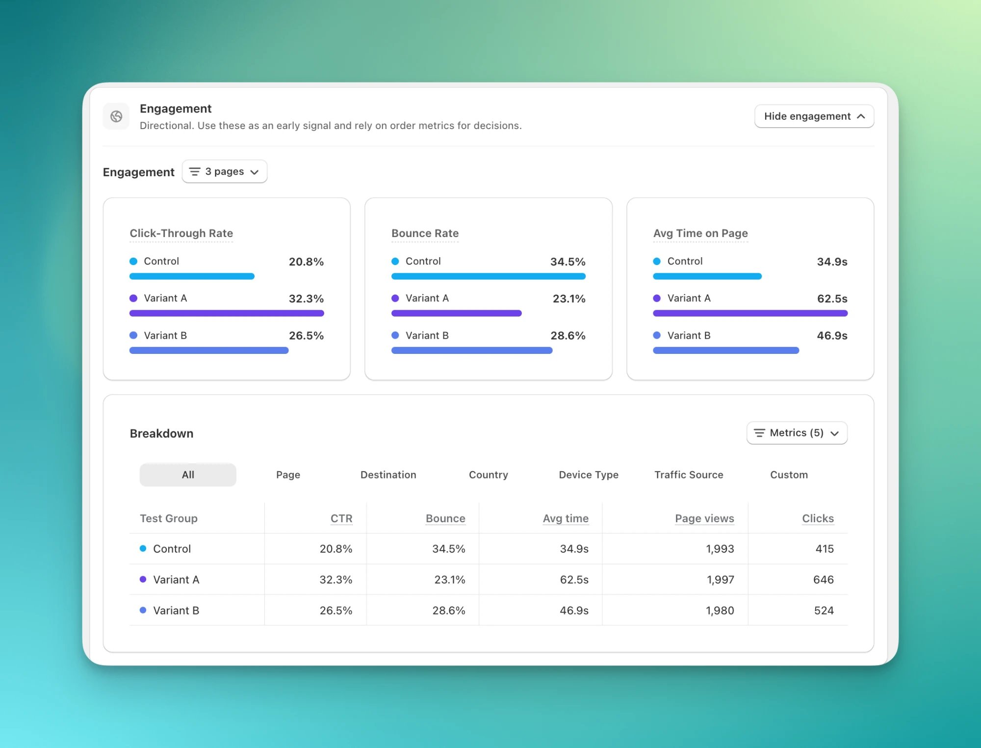
The Engagement section
Custom Events
The Custom Events section compares the share of visitors who triggered each selected event in every test group. These results are directional and do not include statistical significance. See Set Up Custom Events and Use Custom Events in Analytics.The toolbar
The toolbar sits above the result summary. It is where you choose the measurement view, filter the data, check its health, and export orders.
The toolbar
Date range
Pick a preset such as Last 7 days or Start to date, or set custom dates. Useful for checking the impact of a promotion or seasonal change.Measure results by
The selector between the date range and Filters names the measurement view every number on the page uses. It is not a filter — it decides who counts as the denominator, so read it before you read any rate:- Visitors who experienced the test tells you whether the change was effective for the visitors who entered the test experience.
- Assigned visitors tells you the scale of its commercial impact across the full audience assigned to the test.
What counts as experiencing the test
A visitor is counted under Visitors who experienced the test at the first point where the test could affect them. That point is different for each test type, so exposure means something specific to what the test changes:When an order counts toward a test
An order counts toward a test only if the visitor was still in that test when they checked out. Most conditions in Audience Targeting are settled when a visitor first joins a test and never change. Customer conditions are the exception, because signing in can reveal something the condition cares about. A shopper browsing as a guest gets a test price, then signs in on your storefront as a wholesale customer on a test you limited to retail. From that point the test stops applying to them, and an order they place stops counting toward it.Filters
The Filters dialog has two settings:Compare
When a test has more than two test groups, Compare switches between viewing all test groups and one test group against Control. In All groups, the verdict anchors on the strongest test group, ranking significant results first.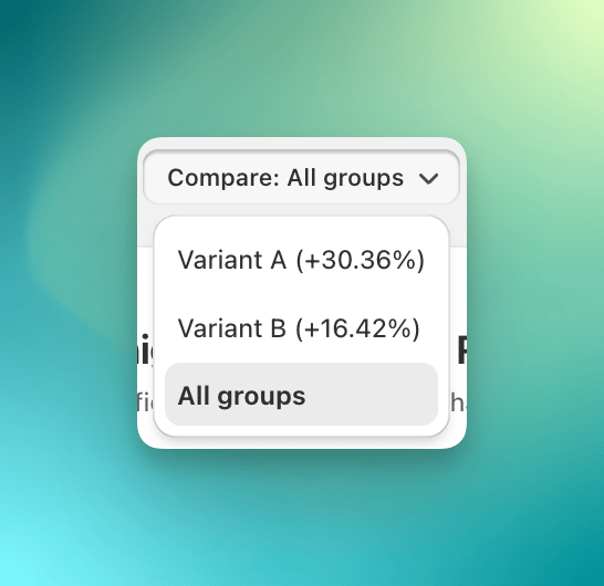
Compare one test group against Control
Export orders
To check results in your own tools, click the Export orders button. It downloads the order data behind the results, up to 10,000 orders.Refresh
Opening this dashboard recomputes your results if they are more than an hour old, so what you see is at most an hour behind your store. Updated shows when the numbers were last computed. To recompute them now, click Refresh.Health
Health verifies that the test is collecting trustworthy data. A green dot means every check passed, amber means one needs attention, and gray means the storefront checks have not finished verifying.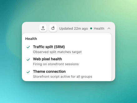
The three Health checks
- Traffic split (SRM): the actual split across test groups matches the target split.
- Web pixel health: the web pixel is firing on storefront sessions.
- Theme connection: the ABConvert app embed is active on your live theme, so visitors see the changes in each test group.
FAQ
Why does the dashboard say 'Not enough data yet' when I already have hundreds of visitors?
Why does the dashboard say 'Not enough data yet' when I already have hundreds of visitors?
What does 'X% of assigned' under Total Visitors mean?
What does 'X% of assigned' under Total Visitors mean?
Can I go back to the old dashboard layout?
Can I go back to the old dashboard layout?
Why can't Search products find my product?
Why can't Search products find my product?